Screen design 3 min read
Simple SCADA screens: color only for alarms
Gray backgrounds, few colors and indicators with context help operators notice abnormal situations. The core principles of the high-performance HMI approach.
Published:
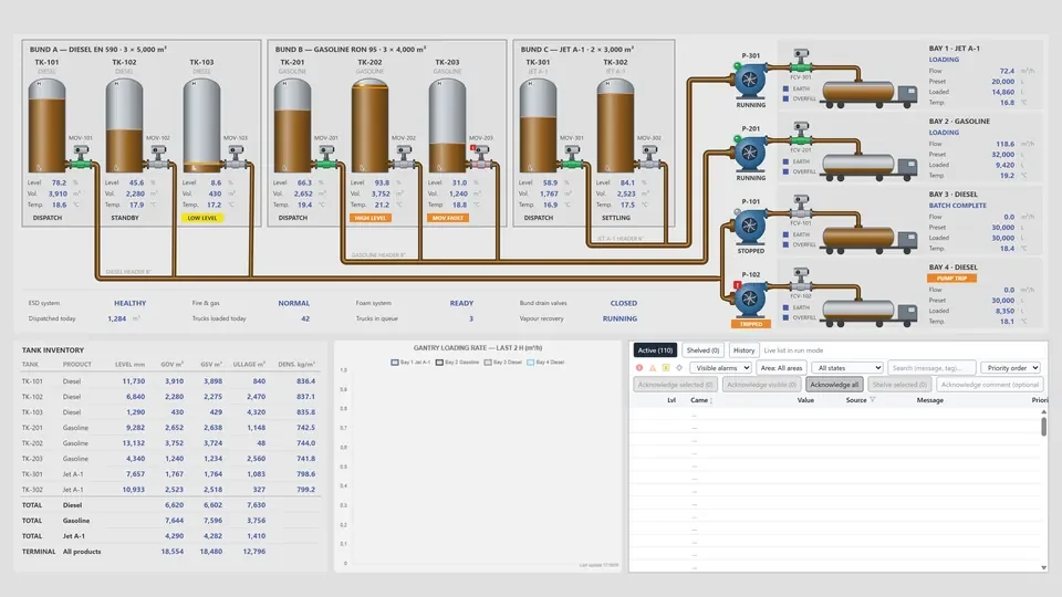
On many SCADA screens the pipes are blue, the pumps green, the tanks three-dimensional and the background dark. It looks lively at first glance. But when everything is colored, the one red indicator that needs attention gets lost in the crowd. The high-performance HMI approach answers this simply: keep color for the conditions that need the operator’s attention.
Why simple?
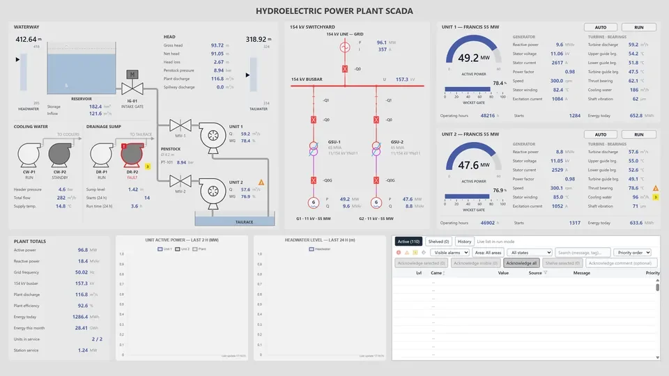
Most of the time, an operator’s job is to confirm that everything is in order and to notice quickly when something is not. On a neutral gray background the eye picks out a single colored spot at once; finding the same spot among ten colorful objects takes much longer. That is why, in high-performance HMI practice, the screen in its normal state is deliberately calm: shades of gray, thin lines, legible text.
Findings from the Abnormal Situation Management (ASM) Consortium and later studies point the same way: displays that bring abnormal conditions forward help operators notice problems earlier.
Core principles
A neutral background and a limited palette. The background is light or mid gray and equipment outlines are dark gray. Saturated colors are used only for alarms and abnormal states, so every color on the screen carries a meaning.
Consistent alarm colors. Each alarm priority gets one color, and that color appears nowhere else on the screen. About one man in twelve has some form of color vision deficiency, so color never works alone: the alarm indicator also shows a priority number or a distinct shape.
Context instead of bare numbers. “72.4 °C” on its own says little; to an operator who does not know the normal range, it could be good or bad. Analog indicators that show the normal range as a shaded band tell at a glance where the value stands. A short trend line shows which way it is heading.
A display hierarchy. Screens are arranged in levels: an overview that summarizes the whole plant, unit screens for controlling one unit, detail screens for a single piece of equipment and diagnostic screens for troubleshooting. From the overview, the operator gets to the problem in a few clicks.
No decoration. Three-dimensional tanks, spinning impellers and flickering flames catch the eye but carry no information. Motion and blinking are kept for conditions that need a response, such as a new alarm waiting to be acknowledged.
Consistent symbols. The same kind of equipment is shown with the same symbol and the same layout on every screen, so even an operator who sees a screen for the first time can read it quickly.
Making the change
Existing screens do not have to change overnight. A practical order could be:
- Write a color and symbol guide: background, line, text and alarm colors, equipment symbols and text sizes.
- Work with the operators to find the screens they use most and the values they actually watch.
- Redesign the overview screen first, following the new principles, and ask the operators what they think.
- Design shared symbols and indicators once and use them the same way on every screen.
Screen design in YTCC
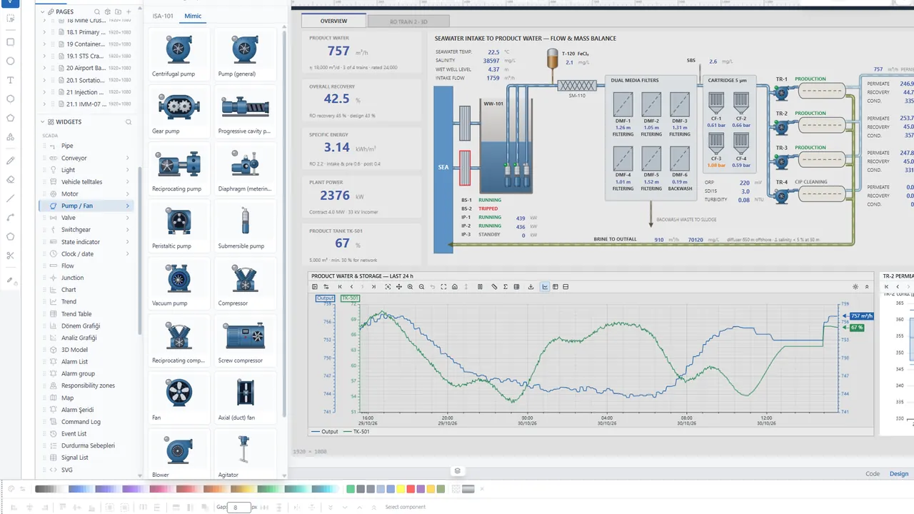
In YTCC, runtime screens are designed in the screen editor in the browser: SVG based, with many ready-made objects, symbols and parameterized symbols. Because a parameterized symbol is designed once and reused for different equipment, it is easier to make the same equipment look the same on every screen.
For the ready-made objects and symbols, see the Symbol Library page.